Pages

Saturday 10 December 2016

What can Contact prints tell you.

I have written on this subject before outlining the advantages of making a contact print for your negatives. The subject has come to the fore because a recent example shows that the negatives are poorly exposed and possibly have a higher than normal amount of contrast.


 So where to start? With the sheet of negatives. The first thing you notice about them is that they are well developed with good tone and detail but on the dense side, meaning they could be over exposed / developed. Something that can sometimes be difficult to judge from the neg's only.
 
The contact print is saying that the negatives are well and truly over exposed and or over developed meaning that to get a balanced image is going to require a longer than normal exposure. It is also suggesting that the images are hard (a lot of contrast) How much will not become apparent until the segmented test print has been produced.


My normal exposure set up for the enlarger is F8 at grade 3 this is my datum point to which I judge how well I have exposed and developed the film. The first test print confirms that the negatives are very over exposed, requiring a second test because the results are so weak. I must admit that I was a bit blasé with my pinhole camera exposure times. This camera tends to bring the worst out in me when it comes to proper control but then it is all part of the fun.


I have already compensated for the longer exposure time by opening up the enlarging lens to F5.6 doubling the amount of light I would usually need. I also know that the contrast is higher than normal from a previous set of exposed photographs. It is to do with the Studional I used to develop the negatives in. A previous session showed that the softer grade 2 would give better results.


Without the contact print I would have spent much longer in the darkroom making test prints to find what the base exposure should be, if I had not been pre warned. It also indicated that the completely white looking skies would require a lot of burning in to bring the detail out shown on the negatives.


For me making a contact print ensures that I get the most out of my printing session. It allows me to preplan what I need to do to get the best out of each negative without wasting a lot paper and time. The later for me is always in short supply.
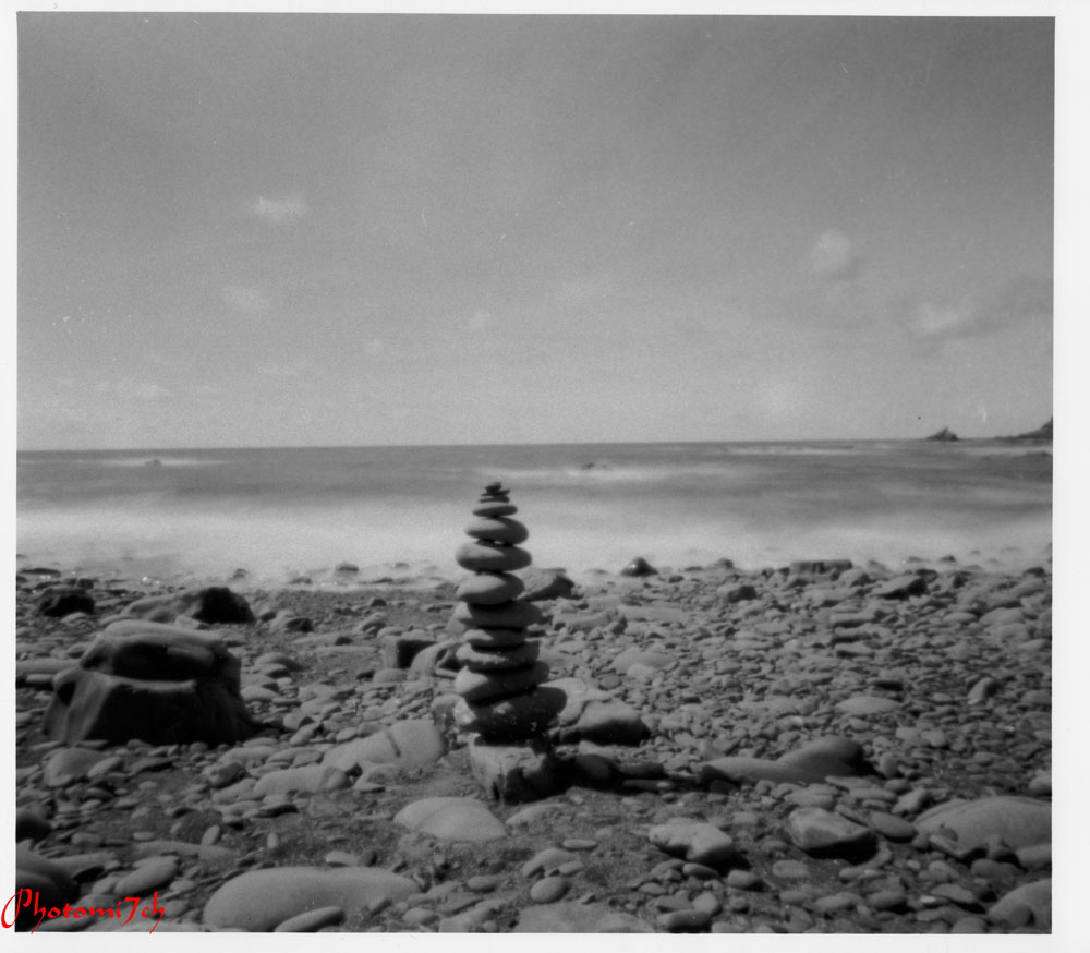

Technical data:

Zero pinhole multi format 120, tripod used, Film Fomapan 100, ISO 100, Developed in Studional, Printed on Ilford multigrade gloss RC 8 x 10, Developed in Tetenal Eukobrom 
AC.


Unintended double exposure.


Saturday 3 December 2016

Freestyle printing session


I don't know about you but sometimes I find the constraint of having to make a segmented test print to determine the right exposure for each negative tiresome. I sometimes feel that it interferes with the creative process. On these occasion in the darkroom I put myself to the test with what I call free printing. I can see some of you shaking your heads at such a notion. It is a way of pushing your instincts creatively. 

Let me lay out the rules of this creative freedom. I pick a random sleeve of negatives, run my eye over them to see what catches my attention. Load that negative into the enlarger and then make a half sheet test strip at five second intervals. This will be the only test strip of the session providing the starting point for each subsequent negative I opt to print. I give myself two attempts at getting the exposure right using my experience and knowledge (best guess) to refine it with dodging and burning. This is where your print technique is put to the test and your ability to choose negatives of the same density.
First print.
 

Into the darkroom. I have chosen a set of 35mm negatives that have a selection of landscapes I made while I was in the lake district and the one that took my eye was looking across the lake into the sun. As gooder place as any to start the printing session.


After adjustments

With this negative loaded I set up the enlarger as follows: the lens to F8 and the paper grade to three. These are the most common settings I use when printing. The paper used is silverproof matt. With the test strip made I look carefully at it to work out the overall exposure and how much more light may or may not be needed for a balanced print. 


The mountain into the sun image is the one I made the test strip for. Even so it proved difficult to get right. I chose to print overall at 32 seconds adding an extra 15 secs for the sky. This did not allow for the mountain slops on the left of the picture which needed less light to stop them completely blocking out. The burning in of the sky did not take into account the brighter area to the center right leaving it a bit blown out. So for the second print the mountain slops to the left were held back for -7 secs and the off center sky received a further +15 secs.

Before adjustments

After adjustments


The second negative chosen was the fence post into the sun. I already knew that overall this would require less light to print, the trick here would be by how much, after a bit of consideration I opted for 27 secs. Which worked well but I felt it needed even less. Overall the second print was exposed for 24.5 secs with an added 5 secs for the sky. Not much of a change, but the affect on the foreground was positive.


Before

After

Right first time no adjustments


The third negative is of the dog in the lake. I chose 25 seconds for this because the negative looked a bit dark indicating some over exposure. I was too bold with my exposure time as the print is a bit washed out with no sky. So I up it to 28 secs and added +28 for the sky. In cases where the sky is whited out I double the amount of light when burning in. Overall a much better picture.


The final image looking through the trees is a straight print, the overall time is 27 seconds. I'm happy with the print, yes I could adjust a couple of bits, but they would not add much to the overall look.

Free flow printing sessions are not always successful but it does free my mind especially if I'm having a bad time getting a picture the way I want it. 

Saturday 19 November 2016

Picture Post Fisheye.

I am very pleased to be able to share these images with you. From time to time I'm asked to process and print for an artist friend. This is my first exclusive you will not find any photographs by this artist anywhere else on the net.


Technical Data:

Camera lomograph Fisheye 2, hand held, Film Fomapan 400, box speed, developed in RO9, Printed on Kentmere VC RC gloss 9x12, developed in Tentenal Eukobrom AC.

All the images I print are chosen by the artist from a contact print of the whole film. I'm instructed not to dodge or burn  unless it is really necessary. 


Sunday 6 November 2016

Studional first use.

Negatives developed
in Studional.
The darkroom is beckoning again, with the death of my father the will or the inclination to do anything connected with film photography has been at a stand still. It is as though my creative energy has been knocked out of me. It was the childhood wonder I had in his fold out camera that peaked my interest in photography in the first place. Spurred on with the little camera he then gave me. Which was later given away.


The darkroom has suffered with my long absence. It is a dusty dirty hole in need of some maintenance. I have also neglected to replace used up materials: film developers, photo papers etc. etc. It has taken time getting things back into shape, for now I will have to make do with what I've got materials wise. Which just happens to be a fresh bottle of Studional.


This is A&Os formulation of the once dead developer. It is advertised as a fine grain, clean working general developer - that can be used in deep tanks?? - or single use. I have interpreted deep tank to mean batch development where a number of film can be processed from a single batch of diluted developer. It suggests dilutions of 1+15 to 1+30 for one shot use. So I am assuming the same for batch production.

Grain pattern produced by Studional on FP4+.
The colour cast represents printing grade three.

I have been told that this developer is akin to RO9s and can be treated in the same way. This is the first time I have used it so I will do as suggested - which is not my usual way of working - I tend to do what my instincts tell me; I must still be out of sorts!!


I have a number of rolls of 120 FP4+ and 35mm Fomapan 400 to process. Checking through the dilution chart it suggests a dilution for the above films as being 1+15 with a developing times of 3.5 and 6 minutes for the Foma. (Digital truths dev chart is a good place to go for dilutions and times.)


I have made up a litre of the developer at 1+15 and intend to use it as though it was RO9s that means on the day of dilution you can process 12 film of mixed formats in a litre with no time compensation. The developer is good for three months with compensation factors for how long the developer has been stored diluted. (Adjustments: 1-3 days 5%, 4-8 days 10%, 1-2 weeks 15%, 2 weeks to 3 months 20%.) I know it sounds a bit flaky but true, I have already tested this with RO9s so I know it works, with no degradation in the quality of the negatives. Like RO9s you will need to protect you hands when using it. It has a caustic bite, this is the second developer that I have experienced this with.


On the day of dilution I processed four films: Two FP4+ and two Fomapan 400 both were exposed at box speed. I developed the Foma for the suggested time and the FP4+ at 4 minutes. Using my standard agitation method: 12 inversion in the first min and then 4 each min after that. Short developing times like that of FP4+ always makes me feel there is something missing. I think it is because I'm used to using longer times. The results are clean and crisp with a good tonal separation. They also look to have more contrast than what I'm used to.

I didn't know at the time of making up the developer that it would take a month till I would use it again. This time with a couple of rolls of 120 FP4+ and Foma 100. In this case I added the 20% compensation. After the first set of neg's had been processed I checked them. No change in the tone or quality which was good news for those that followed. In all, the developer produced ten good sets of negatives before the three month suggested time period was up, without any noticeable changes to contrast etc.


I have contact printed all of the film processed in the Studional. Out of the hundred and seventy negatives only a couple show signs of air bells (bubble marks) which is not bad, I have experienced a lot worse. The contact prints were made on Ilford multigrade RC gloss, developed in Tetanal new Eukobrom AC.

Having printed some of the individual negatives I can confirm that there is an increase in contrast and that it has a fine grain structure. It has helped to produce some finely toned photographs. It has also helped me regain some of my creative spark that has been missing over the months. I cannot say the same for writing these articles I am still finding it difficult to get started.


Technical Data:

Bronica SQAi Hand held, Film FP4+ @ 125 ISO. Box speed, 120 format 6x6 negative, Printed on Ilford Multigrade gloss RC 10 x 8 @ grade 2 developed in Tetanal Eukobrom AC.


Friday 28 October 2016

Picture Post Zero

It has been sometime since my last article reasons behind this absence will become clear in later posts.

To get things going here are some images I made with a Zero pinhole camera multi-format.  


Technical Data:

Zero multi format, Negative size 6x6, Film FP4+, Developed in ID11 (first five), Developed in RO9 (last three) Printed on Ilford multigrade RC gloss, Grade 3, Developed in Multigrade.


Wednesday 16 March 2016

H. BC word of wisdom 2


Photography seems like an easy job but it demands a strength of concentration together with an enthusiasm and a particular discipline of mind. It is through great economy of means that simplicity of expression is attained. One must always take photographs with the greatest respect for the subject and from one's point of view.


This is my personal choice: from this I have a very strong prejudice against photographs that seem ' pre-arranged' or 'set up' 

By Henry Cartier Bresson

Wednesday 9 March 2016

Agfa film grain comparision.

This set of images proved more difficult than the last set of grain pictures. I think I need more practice or a better method.


Developer ID11
I checked back through my archive of negatives and found that over the years I have used four makes of developer with this film - ID11, PMK Pyro, RO9, and RO9s. 


The RO9s negatives were processed in developer that was more than the suggested best before time of three months. Although this developer was still viable it starts to produce a courser looking grain pattern than when it is used fresh. 


Developer RO9 Special


Developer RO9


Developer PMK Pyro


Monday 7 March 2016

Picture Post Introduction The Forgotten.

This is the first in a new series. This is where the image has center stage and the writing takes a bit of a back seat. I may include some thoughts on the pictures but will be kept to a minimum.

  To give you an idea of what I mean:

This series of images were made in a church grave yard in a small village not far from me. A place I have visited a number of times over the years. It has a quiet air that encourages you to sit and contemplate for a moment or two. On this occasion I could not resist making a few images, it was the way the light was streaked across the ground catching the frost making it sparkle that set the camera to my eye.


After I had processed the negatives I scanned them to the computer to sort out the levels and tone of the pictures, a feeling of sadness came over me. As I studied each image that was worked on I had a strong sense that these were now the forgotten.


Technical data:

Nikon FM, lens 80-210 zoom with macro, film HP5, ISO 400, developed in ID11 for 14 mins.


Sunday 6 March 2016

H.CB words of wisdom.

Nikon F5 80-210 zoom. Agfa APX, ISO 100, developed in RO9s.

Time runs and flows and only our death can stop it. The photograph is a blade that captures one dazzling instant in eternity.


Henri Cartier-Bresson

Sunday 31 January 2016

Patterns of negative grain.

RO9 developed FP4+

Ever since I started writing this blog I have been looking for a way to show you what grain is produced by different developers. I have used a number of methods without success over the years. Until late last year when the need to show what the grain looked like raised it's head again. By chance I had my phone in my hand when the idea to use the enlarger and phone camera together came about. It is one thing to have a good idea it is another to put it into Practice.


PMK Pyro developed FP4+


A long time later I managed to get two good images from different rolls   of 120 FP4+ that I was happy with. They show a visible difference between the one developed in PMK Pyro and the other developed in R09.

 When I have more time I will make  images of other film developer    combinations if you are interested.   

Wednesday 27 January 2016

FB papers developed in Tetenal new Eukobrom AC.

Four papers side by side.
There is not a great deal I can add to what I have already written about Eukobrom AC. I was not expecting to show you a set of FB prints so soon after my first use of this new developer. The questions I still have need a good amount of time to pass.


A partial answer to one question is that the developer will keep for at least three days after dilution. As long as it is bottled at the end of each session when being used in a tray. A litre of 1+9 strength so far has produced twenty images of mixed sizes. According to Tetenal you should get about 1,353 prints of 30 x 24 cm out of each 250 ml of concentrated developer. Which works out at about 54 prints per 100 ml diluted at 1+9. Obviously in practice this will vary depending on dilution, paper and conditions of use.

While I was developing the FB images I did notice that different    papers could take up to sixty seconds before they started to show any signs that the paper had been exposed and a further sixty to complete the process. Knowing when the increase in images appearance is down to reduced developer activity will take time to discover.


Ilford cooltone fibre base paper
I chose three makes of FB paper: Ilford cooltone, warmtone and natural - all gloss, Fomatone MG classic chamois 542 mat and Adox MCC gloss. All the papers were exposed at grade three but unlike their RC brothers the exposure time had to be adjusted as some of the papers required a lot less light. Again the tones had good separation, rich blacks and clear whites.


Of the three Ilford papers the natural paper took on a cool tone, where as the cooltone took on a warmish tone. This could be the first indication that the developer is depleting. If this is the case then it is exhibiting the same traits as those traditionally produced. The slight colour change indicating that the silver has not been fully developed. I have written about the changes of colour you can expect from exhausting developer in another article.
 
Fomaspeed 524 matt warmtone.


When it come to pushing or pulling the print (This is where you over expose the paper then pull it from the developer when it has reached full development before the suggested time for full development.) I have so far kept to standard use.
Adox MCC fibre paper


If you have not tried it yet give it a try. If you have used it let us know - always interested in what others think.