Pages

Monday 30 December 2013

Local Darkroom.

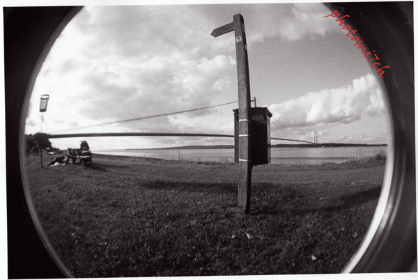
120 format FP4+ developed in ID11
Printed on Kentmere VC
Develop in Ilford multigrade developer


I received an email from Harman technologies (Ilford products) recently about a new initiative that is to be launched worldwide.


The email was sent because I took part in a survey about darkroom use. It had a large response with fifteen thousand people taking part with over a thousand replies on the first day.


This is a summary of the statistics:
  • 69% shot film weekly
  • 35% did not use a darkroom but were using black and white film.
  • 35% without a darkroom were asked would they like access to a local darkroom 78% of them said yes and of those 32% would like some training.
  • 65% said they had access to darkroom facilities provided by work and community with privately owned being the majority.

A second survey for privately owned darkrooms was done with thirteen hundred responses being received. They were asked if they would be willing to share their darkroom and 56% said yes.

With that encouraging result Harman have set up a new free online community www.localdarkroom.com They have already invited tutors and community/ public darkrooms to list themselves on the site. There is also a section for those that have a private darkroom who are willing to share their private space. You will need to be a member of the community to access any of these services, whether training or darkroom in the local area, as there has to be some sort of vetting when allowing people you do not know into your home. For FAQs and more information visit the web site.

I hope this venture is a success and praise Harman for their initiative. But from experience I note that there can be a big difference between what people say on a form and then taking part.


On a personal note I would have liked to open my darkroom to other enthusiasts but it is not practical at the present time. 

Friday 20 December 2013

Paper Flashing the pre-flash.

High contrast negative
printed normally.
After my last post you maybe wondering if this is going to be saucy, you will have to read on to find out.

Types of flashing:


Paper flashing is divided into two types, 'pre' which is done before the negative is exposed to the paper and 'after' which is known as fogging. This article is going to deal mainly with the former as it is a good way of controlling the contrast of hard to print negatives and adding a finer quality to others. It is also the one I have used most often.


How it works:

The first thing to do is explain how pre flashing works. All photo sensitive papers have a built in inertia to light, this means that the paper has to absorb a certain amount of white light before it starts to tone or show detail. When a paper has been pre flashed and the negative is exposed, all the light shining through produces tone and detail, because of this the amount of exposure needed is reduced, in some cases by 20%. This makes the lower values less likely to black out producing better separation in the shadows. It also affects the other end of tonal scale - the highlights, which receive more light, improving the detail and tone being recorded. With the inertia overcome, all the light passing through the negative is working on producing detail and tone. A consequence of this is a lowering of contrast making a finer balanced print.
Print after pre-flash


When to Flash:

Since flashing is a way of fine tuning contrast, it can be used to produce half grades with fixed or variable contrast papers. You do not have to flash to the maximum but can use it incrementally up to the point of tone. You do not have to flash a whole sheet of paper, it can be helpful where a sky in a scene is over blown to just flash that part of the paper. This is done by Dodging (holding back) with a piece of black card the other section of the paper preventing it from receiving any light. Remember that you should keep the card moving otherwise the final picture will have a black line going across it. Most negatives will not require flashing. If used inappropriately it can produce flat and unnaturally long toned prints. So be selective in your approach.

If you're a split grade printer you should not be afraid of pre flashing the paper as it has no adverse affect on this method, but can aid the production of better photographs.

Equipment:

Your enlarger and a reasonable accurate timer. For those who have the space you can set up a second enlarger just to do flashing or you can use a paper flasher by RH Designs.


How to Flash:
The main thing to note about flashing is the method you use has to be precisely duplicable so you can reproduce predictable results time and time again. One method is to set the enlarger light box at maximum height and close the lens down to minimum aperture (F16) with a timer connected, timing the segments at intervals.

For those who don't have a second enlarger things become a bit of a pain having to move the light box up and down like a yo-yo during the printing process. But there are ways round it. You can batch flash your paper keeping it in a separate box but only produce enough for that printing session. Secondly, find your own method of flashing which is what I have done. I move the light box to a height where the light from the lens covers an area larger than the paper I'm using, which is slightly higher than what I would use for printing (don't forget to make a note of the height for future reference). Set the lens to F8 and then time the segment at tenths of a second. You can increase the timing by closing down the lens. Don't be afraid to experiment to find a method to suit. You can do all this with the negative in the carrier and use a diffuser under the lens that scatters the image enough not to make an impression on the paper, but this can lead to overly long exposure times.

Making a test strip:

Test strip
The method is the same as making a test strip for printing a negative. You need a strip of light sensitive paper and a piece of black card so you can expose sections incrementally. The only difference is you will need to mark the test strip with a pen so you can see how many segments have been exposed before the paper starts to tone. The paper is developed in the normal way. To check the test strip properly it needs to be totally dry to allow for dry down tones that may appear in segments that look clear when wet. You can force drying by using a hair dryer or the microwave. If you use several sorts of paper the test should be done for each and then stick the results to the front of the box for reference. It also means that each new box you purchase will need a test, as each new box is a different batch.


Exposure curve.

This simplified exposure curve shows what happens to photographic paper when introduced to white light. The lower part of the curve marked 1-3 is the area of 'inertia' when exposed for this short period of time and then developed there would be no change in the tone of the paper. When timed to 4 and developed there should  be the first signs of tone 4a. If you then time it to 5 at the top and develop it, it would be maximum black. (also known as D MAX) to add any more time after this point will not make the paper any blacker than black.
Flashing is about giving the paper just enough white light to get it to 3 before you expose the negative to extend the tonal range. Further white light from this point 3 is a different type of white light known as fogging.

Friday 13 December 2013

Is it a love affair?

This is the saucy minx of an F5  I use to take most of my photographs with, coupled with the sexy little prime of a 28 mm lens. Add a roll of Agfa APX to caress the back of the focal plane shutter and I'm in for a sensual day of picture making.

With camera in hand I stroll out into a bright day with a gentle heat, fanned by a breeze that shifts the leaves on the trees. Now looking at the image in the view finder that is alive with dancing shadows I wait with finger poised touching the trigger in growing anticipation, waiting, waiting for the right breath of wind to push the shadows into place to complete the composition the eye so lusts for.

Click! anticipation spent, I turn away moving to the next flirtatious view to seduce my eye and so the day is flirted away click by click. Before I know where I am an entrancing morning has been teased away.

 
Not quite what I had in mind when I started writing this cheeky post but it does sex up the thought process behind the taking of each image made. A bit of fun at my expense. Believe it or not there was such a day and the pictures that illustrate this post are the results. A full days exposure and legal too!


Friday 6 December 2013

Split grade printing with High contrast negatives.

Very high contrast grade 0
A recently developed set of negatives have shown themselves to be very contrasty even by my standards. During the summer I was on an early morning shoot, when I came across these scenes. They were not the easiest pictures to meter, there was a six stop difference between the light areas and the shadows in some cases. Two things drew me to them: the  way the shadows of the leaves danced on the walls in the gentle breeze and the other was a brief thought that they would be a challenge to split grade print.  


Soft grade 0
It has been suggested that split grade printing works better when the contrast stakes are raised. In these cases they maybe unprintable. The pictures were made using 120 format FP4+ developed in ID11 for 14 mins I know this is longer than what is recommended but I have found I have a tendency to under expose when using medium format cameras.

I used Ilford multigrade developer and RC paper. I tend to use RC papers in the initial stages or until I'm happy that the picture warrants printing on FB paper.


With grade 5 added
I started the grade zero test print for the Gate but it became clear while I was doing the timed segments that I may not need a grade five test because  the contrast was very high even for zero. I chose sixteen seconds for the gate picture to illustrate the degree of contrast this negative has. The window shutter picture also proved to be overly contrasty as well. I was quite happy with the results until I did a second print with the grade five added which now makes the first print look soft. It just goes to show how things change when you start to explore the subject at different settings. None of the prints have been manipulated by dodging or burning in which could class them as the perfect prints?

Friday 29 November 2013

Ye old R3

Out of date R3
Over recent times I have had the tidying up bug  including a good rummage round in my film cupboard where I discovered four rolls of film. Nothing remarkable in that, I hear you say! However what I came across were two rolls of Rollie retro 100 and two rolls of R3, tucked away in a corner! I know! very out of date unless your name is Mitch in which case they are reaching maturity. It is strange how things come together. I recently posted a very grainy picture of a surfer dramatically falling off his board to illustrate how grainy things can get if you do not process your negs correctly. The film used to take the picture is the late lamented Rollie R3. If I had used the film with a fine grain developer the 1600 ISO negatives would have been a lot smoother.

R3 used at 400 ISO
When available it was advertised as a variable ISO film ranging from 50 to 3200 The idea of a ultra fast film is what encouraged me to purchase some. It took a little while for me to find a suitable subject to test it out on. By chance I was walking along the coastal footpath into Croyde Bay with an empty camera.  So I loaded the R3 set 1600 ISO and spent an hour or so taking pictures of surfers as the sun went down.

R3 used at 400 ISO
I cannot believe that it was 2009 that I last used the R3 and then at 400 ISO, having learnt my lesson previously, I used a fine grain developer. You could not of hoped for a finer set of negatives, they were that smooth it looked as though they had been sprayed on to the film back.


I don't use fast films a lot as I like bright sunny days with lots of contrast. It just so happens I was recently given the imaging warehouses catalogue and while thumbing through it I noticed they stocked Rollie 400s, which got me thinking  how would it compare to the old R3? There is only one way to find out!


Saturday 23 November 2013

Capturing the light, a book about the beginning of photograph as we know it.

This is an excellent read if you are interested in the birth of photography. Written by Roger Watson and Helen Rappaport. It takes you back in time to the years after the French revolution where a flamboyant Louis Daguerre is making his name as a scenery painter and showman. While in the English countryside a young shy gentleman amateur scientist by the name of Henry Fox Talbot plays with the idea of being able to fix a scene on paper using chemicals among other things.

The book is written like an historical thriller as the two gentlemen race to discover the holy grail of chemicals that will allow the light drawings to be  developed and fixed so that all can enjoy their own images, but who gets there first and crowned the inventor of photography?


For me this was a page turner even though I have studied both men in some detail at collage. While I was reading this book I felt that I was being introduced to both men for the first time. This was nothing like the dry text books from my collage days; it is easy to read although in the beginning it has a bit of a quirky writing style but once you get the hang of it the book flies by so don't be put off, otherwise you will miss out!

Sunday 17 November 2013

Split grade printing the next step dodging and burning .

Top grade Zero
Bottom grade five
The use of split grade printing has changed the way I work in the darkroom. Yes it takes a little bit longer having to produce two test prints, but in the long run it cuts down the amount of dodging and burning needed to achieve a finely toned photograph. I have also noticed a luminosity that has been missing from my graded prints. It has also shown me that it is an advantage and not a waste of paper to make full or half page test strips. You get a better understanding of how much more light is needed for the high lights, so you can build this into the first full print of the scene. This saves time and paper having to reprint it again and again to get it right.

I find that my more contrasty negatives are more easily printed using the split grade method, giving more control of not just the tones but also the contrast. Burning or dodging my prints has been reduced considerably, allowing me to add more detail at the extremes. 

So at what point should you be burning in or dodging? The grade zero exposure being the most important one is also the stage at which you should be making your adjustments. If possible you should be including them for the grade five test strip. By doing this you will have a better understanding of how the contrast affects the corrections and make allowances for them in the final print.

Some of you reading this will be thinking it's all to complicated and not for you, Dodging and burning is about having confidence in your ability, once you have done it and seen how it changes your pictures for the better, you will be wanting to do it every time. I enjoy this part of the picture making process, it always reminds me of a composer on the rostrum encouraging certain section of the orchestra to bring out his interpretation. Only you are using light to enhance what you had in your minds eye.

Burning in graduation times
OK I'm going to keep this simple just to give you the idea of what to do. I have only used grades 0 and 5 but in certain cases other grades maybe more appropriate but that is for another time.

Producing the prints:

I produced a soft toned (grade 0) test print at five second intervals. When it was dry I compared the segments to determine which would give the best overall toned exposure and how much extra light would be needed for the sky. I chose seven seconds for the whole picture, this allowed the street scene shadow to keep its detail without it blocking out. A further twenty one seconds would be added to the sky. With the main exposure done the sky was burned in. For this I used two black pieces of card held together to form a V shape. The trick with dodging (holding back the light) or burning (adding light) is to keep the mask moving otherwise a hard line will be left. I gently moved the card backwards and forwards lingering in places to give the sky a graduated look. The times on the picture are there as a guide.

Now I placed some black card over the masking frame to protect the picture from any stray light, while I adjust the enlarger to grade 5 for the contrast exposure. The first segment was covered and then exposed at two second intervals there after. Again when dry I chose 3 seconds.

Final print
With the all the times combined a full print was made. There are some short comings; firstly the build on the left could do with a bit more burning in to bring out the texture of the wall and if I wanted to be really picky the sky could do with masking in more precisely which would mean cutting a mask that mirrored the buildings outline.
 
The idea was to keep it simple and to show what could be achieved with the most rudimentary of masking off.

Monday 11 November 2013

William Egglestone guide.

A while back I was looking at the photography section of the Foyles web site. When I came across a new copy of William Eggleston guide. I had to check to make sure that I was not wearing trick glasses. As far as I was concerned it could only be obtained second hand. So I did the right thing and purchased a copy and waited to see what came through the post.

It was reprinted in 2011 and first published in 1976 by the museum of modern art New York. It had been produced in conjunction with the début  exhibition of William Eggleston. The critics slammed the exhibition as boring and banal, by doing this they had completely miss read Eggleston's pictures.  Yes it was jejune and mundane, all in wonderful bright colour but that was the whole point. The common place in society was no longer the preserve of black and white. It was suddenly hip to make this type of picture using colour film.

The quirky nature of Eggleston's pictures is what appeals to me, the sense that there is more going on outside the frame makes me linger just that bit longer in case all is revealed! I know it is the 'picture of a moment in time' that appealed to Eggleston's eye; and  his view of the world, the way he puts it across that intrigues me.

I like his attitude - see the picture, take it and move on. He is not one to exhaust the view from every angle and at three different settings types. He knows his own mind and is prepared to take a risk, if it does not work he has not then wasted a whole film. In this respect I'm with Eggleston. 

The book is an unusual size being 9 ½ inches square (240 mm). A modern take I feel. I'm not sure that the first edition was this size. The cover has a simulated leather embossed feel to it with the picture inset. The pictures appear on one side of a double page spread. William Eggleston does not go in for giving his pictures titles but reveals the place where it was taken. Could a place name be a kind of title? The pictures do not always stand central on each page giving the book a rhythm of it's own.


I'm pleased this book is part of my collection after all these years.

Friday 1 November 2013

PMK Pyro negative comparison.

Fg 1
Over the past several weeks I have been tidying up and cleaning out the darkroom making it ready for the winter season.  I don't know about the rest of you but I end up with a number of storage leaves full of negatives hanging around from previous printing sessions. While sorting them into order I noticed that a number of them were marked PMK Pyro afterbath. Wait a minute, these negs look more tanned than when I first processed them!. I did mention in another post that on first comparison the differences were slight and therefore not worth doing. On comparing the negatives now, the afterbath tinting stands out. ( see Fg1) Which would suggest that the developer continues to oxidise over time to some degree.

After giving this some thought I wondered if there would be any differences in how they printed, the only way to find out would be a practical comparison. I didn't think it would be enough to judge PMK against its self so I introduced a set of ID11 processed negatives to the equation. Both developers produce a fine grain just how fine I was not sure.

Materials for the comparison.

ID11 negative.
All the negatives are FP4 + 120 format and 6x6 in size. (the 6 x 4.5 negatives in Fg 1 were substituted for another set) Surprisingly they were all developed for 14 minutes in their respective developers. The afterbath neg's were exposed using a Zero Pinhole camera and to be honest is the only time I have used the afterbath. All the negatives are printed on Ilford Multigrade RC gloss  and processed in Ilford MG developer using the split grade printing method.


In the darkroom.

The first thing I noticed was the difference in the clarity of the grain in the focus finder. The ID11 negatives were easy to focus, they had a defined grain pattern. The next neg I looked at was the PMK without afterbath these had a smoother looking grain pattern making it a little difficult to focus. The afterbath negatives had an even finer grain pattern, taking longer again to bring into sharp focus.

PMK Pyro negative without afterbath
The printing of each negative was straight forward. Once the pictures were completely dry I placed the three of them together in front of the window on a bight day to study them.  The first thing I noticed was that the PMK negative prints looked warmer than the ID11 print; had a cooler more black and white look. I find that Ilford papers tend to have a warmer feel in comparison to the Foma papers I use. Next I noticed that the ID11 print looked crisper, sharper perhaps than the others this maybe be because the contrast was more defined or as other people have suggested that PMK negatives are softer due to the staining affect this developer has. One thing is for sure the afterbath neg is softer contrast wise, this was noticeable when it was being printed; as a rule of thumb I have found when setting the contrast part of the split grade method the timing is about half the time needed for the toned section. In this case it needed more and still looks soft. 

Conclusions.

PMK Pyro negative with afterbath
It would be unfair to conclude that the afterbath negatives were less sharp as they were taken with a lens-less camera and softer to start with. But when considering the other PMK Pyro negative I can say that it appears to be softer in sharpness when compared to the ID11 picture. With that in mind you could conclude by association that they would have been softer again. Therefore adding credence to those claims that PMK Pyro used with afterbath are less sharp but more subtly toned. When compared in isolation you would be hard pressed to notice a difference at all.


I believe that it is down to individual tastes when it comes to sharpness and if it was not for this comparison I would be none the wiser as far as my eyes are concerned. And that is all that counts.

Monday 28 October 2013

Massive dev chart App

Digital truth have produced an app for all that wonderful film developing time data they have on their site. Called the Massive Dev chart timer. It has different colored screens so it can be used in the darkroom and will recalculate times for different temperatures.   

Now you can get any combination of  film and developer the heart desires at the touch of a button on your phone. It will cost you £5.99 and comes in Android and Apple flavors.


Friday 18 October 2013

Basic kit for producing Black and white negatives.


For those who are thinking of processing their own film it can be quite daunting for the first time. If you keep things basic by using popular brands like Ilford and Kodak for film and chemicals not much can go wrong. What people don't tell you is that film like FP4+ is quite forgiving and a good place to start processing for the novice, making it quite easy to get good results.

With the advent of digital the darkroom has become a lightroom with the help of a scanner and changing bag. You no longer have to look for a place in the property that is or can be made light tight.

The basic kit:

Changing Bag: looks like a tee-shirt without a hole to put your head through and is double lined to make sure it is light tight. It will take time too get used to and will require some dummy runs to get the feel of it. Developing tank: there are two types, 35mm and universal. The universal tank will allow you to process 120 format as well as 35mm; you will also need to practice loading the film onto the spiral. Oh! before I forget there are two types of spiral plastic and metal each uses a different Technic to load. I would suggest starting with the plastic type first as it easier to get the hang of. Force film washer: is a tube that fits onto the water tap and into the top of the developing tank. It is for putting water into the tank for the wash cycle. Three measuring jugs that will cope with more than 600 mls of fluid, Chemicals: Developer, Stop and Fix, all come as concentrate or powder and will require mixing with water to get the right working strengths. Spirit thermometer: for checking that the chemicals are at 20 degrees C. Storage containers: of a suitable size will be needed to keep diluted chemicals. Wetting agent: by putting a couple of drops in the developing tank after you finish washing the film and a minute before you take the film out helps to prevent drying marks on the film. Film clips times two: so you can hang the film up to dry and if you place one on the bottom it stops the film curling while drying. An alternative is to use Pegs.

Friday 11 October 2013

On a personal note.


120 negatives.
Welcome to the blog and thank you to all who have taken the time to read it. First of all, Photo Mitch was a phrase that my friends used to shout at me whenever they wanted their picture taken. In those days I was the only one in the group who went out with a half decent camera and interested enough in photography to do so. Now a days everyone is a budding David Bailey. Who is he?


My Dad introduced me to the wonders of Photography and encouraged me with a 120 format Instamatic range finder, this gave me the freedom to take pictures whenever. It was not until my late teens that I was in a position to buy my first SLR camera that turned out to be a Nikon, this improved my picture-taking skills to a level that allowed me to take on commissions. After some years in the doldrums, my wife encouraged me to take a C&G photography course, which re-ignited my interest for photography.

Featured in Black and white
photography magazine


My photography has been influenced over the years by the art world and artists like Dali, Matisse, Picasso, Andy Warhol. As well as photographers like Fox Talbot for his early pictures, William Egglestone for his get it right in one frame of mind, David Bailey for his belligerence,  Paul Fusco, Henri Cartier Bresson for watching and waiting, Roger Hicks for his no nonsense approach and the architecture of the Art Deco movement for its bold lines. Which makes for a bit of an eccentric attitude to picture making. 

Digital

Having been introduced to film at a very young age I still take a large number of pictures in black and white. This does not mean I shun digital, I use it a lot, it's another format that allows me to express my view of the world. 


I hope what you find posted here interesting and helpful, I know it talks about out dated methods that a lot of people feel should be dead and buried; but it is the foundation to the digital age, with many aspects in common.


This picture was taken on
Zero pinhole camera.
From a personal point of view, blog posts that run to thousands of words make my heart sink no matter how interesting or well written they maybe. I believe that posts should be snippets of information; with this in mind my posts will be shortish if that is possible. Subjects that need more explanation will be done over a series of posts.

The time of year will influence my post rate. Put another way, if the suns out so will I.


Sunday 6 October 2013

A bit of a surprise.

There was a new kid on the block, a brash whipper snapper that goes by the name of Fisheye 2. This little fellow punches above his weight with the quality of pictures he produces. I'm not sure why I am surprised at this. I can only think that my view of the toy camera market has been tainted by the snobbery of professionalism! It is a brilliant piece of kit that allows a further string to the creative bow.

Let's be honest it is not my camera. My wife purchased it because she loves the fish bowl effect it produces when printed. She also thinks that the double, triple and many more exposures on a single frame are awesome. But the main thing is ease of use. 

This can lead to a bit of a dispute over who took what, especially when both of us are using it at the same venue! The only rule, once a film is finished we agree that colour or monochrome film is loaded. My wife prefers colour but more black and white film has been exposed.

Basically it is a point and shoot camera with a 170 degree field of view. With a couple of important buttons the most important as far as my wife in concerned is the little one on the back that allows the shutter to be re-primed for multi exposures and the other on the top right front by the shutter release ( which i think is the most important), this controls exposure the; L position locks the shutter so it is not tripped accidentally; N is the standard setting of 1/100 sec @ F8 and B a bulb setting that allows long exposures.
  

I must admit it's good to get away from all those decisions an SLR brings to the picture taking process. Just concentrating on the composition is  unexpectedly liberating knowing that if it all go's wrong it is a minds eye fault and not a technical one! when it comes to multiple exposures where serendipity influences the mix, some are far better than others.  Nevertheless  always interesting. I felt that I had been taken back in time to the excitement and wonder I experienced with my first camera.

It was a surprise when Elizabeth Roberts editor of  Black and White photography magazine got in touch asking if it would be OK to publish some of these pictures in the portfolio section. An unexpected boost to what has been a bad news year.

These pictures were taken in and around Baton upon Humber area, over a number of visits.  They are a mix of pictures  all made playfully exploiting the advantages of the lens. I had not intended to create a series. It just so happens to be an interesting part of the river Humber with its nature reserves, the bridge and foot path that extends to the estuary.


Three makes of film were used Agfa APX @100 ISO, out of date HP5 @400 ISO and out of date Fomapan 200 @200 ISO all developed in ID11. The pictures have been printed on a number of different photographic papers. The ones that appear in the magazine are printed on silverproof matt. Developed in a mix of Moersch SE6 blue and Ilford warmtone.

Friday 20 September 2013

Avoiding graininess


If you like your pictures smooth and grainless then you need to pay special attention to its avoidance throughout the process. The best approach is correct exposure, development and method; once mastered graininess will not be a problem. When you start using film speeds above 200 ISO it becomes more critical to get the exposure right in some cases a faster film has been used when a slower one would have done the job just as well. In this instance a fine grain or ultra fine grain developer will go a long way in inhibiting the clumping of the silver hilade crystals during the processing, allowing quite large prints to be made without the grain showing.

The main causes of grain growth are:

  • Over exposure.
  • Too highly concentrated developer solution.
  • Too long a development time.
  • Too high a temperature.
  • Too much agitation during the development process.


    This picture was taken using Rollie's R3 variable ISO film set at 1600 ISO developed using R3 developer. If I had used a fine grain developer the grain would not have been this exaggerated. This picture was taken late almost to late as the sun was just off touching the horizon. If I had set 400 ISO it would have been a blur. Apart from that I think it is a good shot caught just at the right moment.

Friday 13 September 2013

Same picture different camera.

The recent airing of a documentary on Vivian Maier sparked a debate between my wife and myself not on the wonderful pictures taken but about her camera equipment and what it has added to her pictures.

Fg 1
Vivian used a twin lens reflex camera (TLR). As the name implies it has a viewing lens of the same focal length placed above the lens in front of the negative. They are coupled together so when the viewing image is sharp it is the same at the focal plane. There are several things to note when using this type of camera. One of the oddities is the image; it is reversed, left is right and vice versa. So if someone or object is moving towards the left of the screen the camera will need to be moved to the right.  It is something that is a bit disconcerting when using the camera, more so for the first few times. The view screen gives no indication of depth of field until the negative is printed as there is no aperture settings. This lens design also exhibits the parallax effect this    is where the juxtapositions between far and near objects are seen  differently between the two lenses. This can be compensated for by moving the picture taking lens up to where the viewing lens is positioned.

Fg 2
With the idiosyncrasy of the TLR explained, it makes the street pictures she took even more wonderful. But I digress, this post is really about - 'does the camera add something of it's self to the picture?' In other words would you have taken that picture no matter what camera you were using?


I have canvassed opinions from other photographers and it has been suggested that the different working methods needed for different camera types and formats would indicate that the camera adds something of it's self to the picture. Or is it just perception? I will admit that certain cameras like the Lomo fisheye 2 undoubtedly adds to the composition in a particular way with its fish bowl negatives and distorted edges, this is also true of the pinhole camera with it's long exposures and blurred movement. These camera are chosen because of these attributes but the same could be said for the main stream digital, 35mm, medium, large format multi lensed system cameras. Maybe the premise is wrong and it is the lens that leaves its mark so to speak.

Fg2
Lets be honest there are a multitude of factors that come into play when making a picture. With the camera lens combination playing the leading roll. I have not until the above question arose, made the same picture with different cameras and formats from the identical place. In my case it just does not happen.


Figure 1 Lomo fisheye 2 and figure 2 Nikon F5 with 28mm lens both 35mm Agfa APX 100 film @ ISO 100 are a couple of examples where I have made the same picture with a different camera in about the same place.


In conclusion the camera and lens you choose to use has an effect on the pictures you take therefore imparting something of is self on the end result.


Fg1

Saturday 6 July 2013

Using the Agfa Isolette camera


Carrying on from a previous post on the Agfa Isolette The opportunity to use the camera was provided by a break in the weather - it cleared enough not to be soaked as soon as you leave the house.


The flip out film holder makes it easy to load a new roll of film. There are in built springs that provide friction, so the film is kept tort, keeping it as flat as possible at the focal plane reducing distortion. The film back clicks shut with a reassuring clunk. It also has a little red window in the back with a sliding cover in which to view the film numbers as you wind on. The film is advanced with a knob on the top right hand side of the camera that has a built in reminder to wind on after each exposure otherwise the shutter will not set.

To reveal the lens you press a button on the top left hand side. In this case the lens followed by the bellows leaps forward from the front of the camera with an enthusiasm that can knock it out of your hands if you are not prepared for such athleticism. Once the front is open you are presented with the five main controls: lens focus, a full set of apertures from F4.5 all the way up to F32. A limited number of shutter speeds: B, 25th, 50th, 100th and 200th A self timer and most importantly a lever that primes the shutter for release. The only other thing present is a connection for flash.

On the top of the camera is the shutter release that allows a remote cable to be fitted, a cold shoe for a range finder or other accessories and another knob that has four settings marked Col NK, NT, K and T. (I do not have a clue as to what they represent.) As far as I can tell it has had no affect on my negatives. It has a viewer and a tripod mount.


After I got used to the idea of guessing what the distance should be set to and then remembering to alter it for different views, I found myself taking shots quickly almost like an automatic. I did take light readings to start with but it became clear that the light levels were stable enough not to need checking for each shot.

It became clear that there was a problem once the negatives had been developed. Some how light was getting into the camera. Having checked it carefully before hand I should have carried on and cut a piece of light sensitive paper to fit the camera and left it for a minute to make sure. Once the paper had been developed in the normal way it would have shown that light was leaking in from the bottom right corner of the exposure chamber indicating a problem with the bellows.


I'm a little disappointed with myself for not doing this check in the first place. If I had followed through with the test, I wouldn't have had a duff set of negs'!. It would have made an interesting set of prints as the gremlin's face in the tree roots shows.


Saturday 29 June 2013

Public art?


To be honest I have not really been that interested in graffiti until the Tate modern had that extraordinary exhibition on the outside of the building. At well over a hundred feet high you couldn't really miss them. Before that, like most people, I was blind to it to a certain extent as I walked the streets of towns and cities across the country. What I did notice after viewing these wonderful drawings is the proliferation of tagging which in my view is a blight on the built up environment. If you are going to do it make it interesting otherwise save the paint.


The other day I had my arm gently twisted to purchase a copy of Wall and Piece by Banksy forcing my interest in graffiti to another level. His book is more a picture book than a read. One of the things I picked up from the photo's in the book apart from his sense of humour, is that we still walk around with our eyes wide shut even though picture taking is at epidemic proportions. On a subsequent visit to another book shop I checked out the art section to see if there were any other books on graffiti and there are quite a few. Leafing through some of them they also depict some wonderful public art. I know! a lot of people think it degrades the neighbourhood, but done well I think it lifts it, maybe it is time to make spaces where it is legal for anybody to post.

What's this got to do with photography? Quite a lot. It is about keeping your eyes open to picture opportunity even if you walk the same streets every day. It has happened to me on a number of occasions where a set of circumstances falls into place, opening my eyes to a composition that I have been blind to in the past. It is a strange sensation to think I have walked this way over the years and this is the first time I have really seen this view. I suspect this happens to all of us from time to time.


Graffiti what are your thoughts?